"It's one thing to make a picture of what a person looks like, it's another thing to make a portrait of who they are"- Paul Caponigro.
Statement of intent
What is your aim?
I aim to produce a google sites demonstrating my ideas, the growth and creativity based around my theme of fashion photography, I will also create a Coggle mind-map to produce all of my ideas. I will use my best and worst photos to contrast the improvement in my work.
What is your initial research?
For my initial research I will start by researching fashion photographers. At the moment, I have one in mind that I would like to look at. I would like to research Kia Hartelius. I have chosen Kia Hartelius because she is a fashion photographer that looks at bright colours in clothing and I think I could get a lot of inspiration from her work. I have chosen to look at Kia's photos by the names of 'contributor' 'vogue Italia' and 'tush'. I have chosen these specific photos because I like the contrasting colours in the images and the way they are set. I also, like the choice of bright colours which she has used e.g bright pinks and yellows on the model and I think I could take inspiration from these types of photos. I picked this photographer because she displays her photos in a unique way and uses complementary colours e.g orange and blue, this is important because then the photo will stand out more.
How are you going to choose your theme?
When I chose my theme, my initial thoughts were to use a coloured backdrop and a stool in front for the model to sit on so I could capture the photo. I could also take my photos in a garden to reflect the green colours off my other colours.
How are you going to show progress?
To show progress I will learn to use different filters and lighting effects on photoshop, I will then use snippet to capture my work to show my own progress. I could also change my camera's exposure to a different setting and focus more on the aperture and iso. To show my progression I could include more of my own images in my work to show my build up of understanding the camera settings and use my best and worst photos to assess how I could improve my own work.
How are you going to experiment?
I would like to experiment with a wide range of techniques within my work, I want to learn more techniques on photoshop to upgrade my work and make it more personalised and creative. I would like to experiment with complementary colours so my work stands out. I will also like to use a tripod to take my pictures so that the photo is up right an looks presentable.
Time Line
I have a maximum of twelve weeks to complete my project however, finishing before Easter. I plan to finish my initial research within the first 2 weeks in order to give me enough time to set up my photos, take them, learn and use the different photographic techniques on photo-shop and upload them to my google sites to be marked on later on. I would like to finish my project in the time given so I will need to concentrate on my work and give my best effort to achieve a good grade at the end of the project/year.
What will you do as your work progresses?
As my project progresses I will do more research on my images and the photographer I am taking inspiration from to insure that I have added all details into my work. I will seek advice from my teachers, family members and peers on how I could improve on my work, as I will always aim to push myself when completing work. After publishing my final photos I will research and write an evaluation on my project and how I found it and what went well for me and how I could improve next time to make my next project better.
Dorothea Lange mock exam

Composition
In this photo there is a migrant mother with her 3 children, the children are facing away from the photo because of the mass poverty and the conditions the family are living in. In my opinion this photo makes me feel sympathy for the young children and the mother because of their living conditions. Eye level in this photo is facing forwards but the mothers eyes turn to her right side to create a look of desperation. I think that a black and white film has been used in this photo, the black and white filming creates a mysterious atmosphere to make you want to know more about the photo, also it makes the people in the photo stand out more and creates a contrast between the dark and light colours. The sweet spot is set in the mothers eyes and rule of thirds is used in the middle of the photo where the mother is sat and how the children are holding onto her either side. The camera focus is set in the peoples faces and in different corners of the photo to contrast white to the darker background. The photographer that had taken this photo has captured pain and poverty in the photo. In my opinion this photo is upsetting because the conditions of the people living in poverty are horrendous however it shows the power poverty has over peoples lives. In my photos I would use composition because it creates a nice touch to the photo.
Content
I think this photo is based on the power and conflict of war and how it left people like this family homeless. This is an old photo that was taken in February 1960. This photo was taken using a black and white film to add a old-fashioned and mysterious effect on the photo. This photo was taken in San Francisco 15 years after the world war 2 so the photo could still be related to war and how it can still affect people and their life. There are 4 people included in the photo; a mother, 2 younger children and a baby on the mothers lap. The effect on the family being in the photo is to create conflict in the photo of what The Great Depression was like for families. The photo consists of a plain dirty old wall, this makes the photo looks a bit more hoary and more interesting to photograph and look at.
Connection
I think the theme of this photo is is the after effects of war and how it can change peoples lives and leave them in extreme poverty and also The Great Depression. The Great Depression was a severe worldwide depression which mostly took place in the 1930s. This image can link to my own work because the photo uses a black and white and in my own work I can use a black and white filter in my own photography to create an old photo. In my opinion there is a dark and mysterious message behind this photo. The message is to bring attention to the struggles of the Depression so that certain events would not occur.
Comment
I like the back story behind the photo because it makes the photo more interesting and makes you learn more about the context of the photo. I also like this photo because the black and white film on the photo adds more of a mysterious, old look- this is also a photo based on The Great Depression so the black and white reflects it. This photo has an nice touch to it because it has lighter places on the woman's face and darker areas of the photo. However, I don't really like this photo because I don't like the subject matter because if reflects a hard time in history, but, its shows the reality of a family living in poverty. I can use this photo
Mock exam

Content
In this photograph I can see half of a girl's face and the shadow of flowers. The girl's face is very still and her hair is very straight and on the left side of her face.
Composition
In this image there is a middle distance because her face is right in the middle of the image. There are also strong leading lines and they help the image to look more presentable as everything is in place. The photographer has used the rule of thirds and this helps the photo to keep in place for example the eyes are at the top of the image and the lips are at the bottom. There is also a sweet spot and this is her yes. They stand out in the image a lot and are very clear to see. The bright colours of blue and green make the photograph of a whole appealing to an artist or someone that is looking at the image. The image is taken at a viewpoint, the photographer has obviously done this so that we can clearly see all of the facial features at once. In my opinion I think the photographer has used the blurring photoshop technique to blur the flowers in the top left corner. I also think the photographer has heightened the shadow so it is more visible on the models face. I think that the photographer has used white balance to make the model's face appear brighter as it is in the picture. I don't think the image is overexposed, it looks perfect. I do think that the photographer has used a tripod so that he/she could get as close to the model's face as they have. In the image the main colours that I can see are purple in the flowers, the blue/green in the eyes, the pale pink lips and the models slightly ginger hair and freckles. There are no patterns in this image. I think yes this image has been a bit cropped so we are only able to see the models face and not anything else. In the photograph there is a blurred out flower brand in the top left corner.
Connections
I like this photographers work because although the image doesn't have huge amounts of photoshop it is still a beautiful picture on its own. This photographer's work is very simple but it is also very eye-catching and there are a lot of great things in the image to pick out. The photographer uses a lot of little technique to achieve this picture without it looking over the top. Their work links to mine because I don't like to add big amounts of photoshop to my images. I like to keep it simple but pretty as well. In this image the strengths are- the photographer uses photoshop to heighten the shadow on the models face and to blur out the flower however a weakness is the photographer should have moved the hair of of the model face before shooting.
Inspiration
In my own photography I want to achieve an image similar to this one but also maybe using the black and white filter and contrasting the difference between the two. I want my outcomes to also be a bit simple like these photographers but have a couple of good points that can be picked out about it. I will use this image to inspire my own outcomes by maybe trying the rule of thirds or adding white balance to my picture to upgrade the quality of the image.
Madgiel Lopez

Content
Born in Havana, Cuba. Magdiel Lopez spent his childhood years inspired by the colourful culture that surrounded him. Naturally, such upbringing played an integral part in forming Lopez's keen sense of style, art and design, which can be realised in his work today. Looking for freedom and a better life, Lopez moved to the United States at fifteen, where he continued working on his skill for the next 10 years privately. Lopez decided to reveal his work, in a series called "A Poster A Day'' - releasing one piece of artwork on his Instagram everyday for 365 days. Each day garnered more attention from a global audience, ultimately leading Lopez to be featured by the New York Times, Cosmopolitan, Entrepreneur, and Awards. To date, Lopez has worked with several brands such as Apple, Nike, Absolut Vodka, MTV, Warner Brothers, etc, and currently has a partnership with Adobe as a design mentor and creative! Sourced from the internet: https://magdiellop.com/about
Composition
I think that the rule of thirds has been used because the image is very centered. The strongest leading line is down the middle because the image itself is very symmetrical. The photographer has used a deep depth of field (F36) because the whole image is very clear and sharp. There is a foreground and middle in the image. The picture has been photoshopped a lot so I’m not sure where it was taken but it could've been in front of a green screen or something. I think the photographer has used a tripod because the photograph has been taken from quite a distance. The photographer hasn’t used white balance because there aren’t any particular light areas in the image. The photographer also has not used iso or aperture. I think the photographer could have used shutter speed as the image is very still in place.
Connections
I like Madgiel’s work because he uses a lot of funky, bright colours in his images and I think it looks really cool and it adds a pretty touch to the image. He uses bright colours like pinks and oranges and they fit really well with the picture. His work links to mine because I want to use bright coloured text on my ‘vogue’ inspired pictures. This image has a lot of strengths but the main ones are the pop of colours the artist uses and the way the picture is set out. I really like the uses of photoshop in his images. A weakness of this image is that the head above isn’t directly in the middle of the image.
Inspiration
I don’t think I would like to achieve something similar to this only because I would like to focus on vogue inspired magazine covers but I do really like the idea of it and I really like the colours used in the background so I may use some of the same colours on the text in t[my magazine covers.

Content
In this image I can see a man's face and shoulders and he is looking to the side. The man's face looks quite sad and disturbed and his eyes are very dark and not very seeable.
Composition
In the image there is a foreground distance. I know this because unlike the other image I can see his head and his shoulders and a plain background instead of just his head. There are strong leading lines and the impact of this on the image is that we can quite clearly see where everything is. The photographer uses the rule of thirds. They do this so we can clearly see where each part of the man's face/body is and it makes it easier to notice. The viewpoint of a whole is at eye level meaning we can clearly see the man. In my opinion this photographer has used a lot of in depth photoshop such as photo dragging- adding one image into another. The photographer has done this because it makes the image look really cool. I think this photographer has used iso to depthen the man's face so it looks a dark greyish colour. I think this image is overexposed but in a good way. It brings out the dark colours in the image. I don't think the photographer has used a tripod mainly because it's not a close up image, it's quite far away from the face. The photoshop tools this photographer has used are the adjustment button and then adding one photo to another- adding the forest trees to the man's hair. In this image the colours used are very dark and edgy. The photographer has used greyish colours and blacks. They have also used the black and white tool and lightened it a bit more on the face but darkened it on the hair and around the body area. There are no patterns in this image. The image has either been cropped or just taken at this angle so that we can only see up to the man's shoulders.
Connections
I like this photographer's work because they have used a lot of different techniques and photoshop to get the final product but it doesn't look over the top it looks amazing. These photographers work links with my own because they have used black and whie in their photography and my new course is using black and white in texture. The strengths and weaknesses of this image are; strengths- I really liked how the photographer made the man's hair look like trees and the black and white looked really smooth. A weakness is I think the photographer could have added more trees to the body of the man so that they both looked similar and contrasted with one another.
Inspiration
I think I would like to try out the techniques that this photographer has used because it could really upgrade my work and boost my mark. I think I would like to stick with just black and white but it would be really cool to add some more photoshop like this into my own work. I can use this image to inspire my own outcomes by adding more photoshop to my images.
3rd photographer research, Kia Hartelius

My starting point is taking inspiration from a photographer called Kia Hartelius. Kia Hartelius is a fashion based photographer, she focuses on colourful, dark and light colours and how they contrast. However, her photos are quite simple with creates a nice touch to the photo. This photo is called 'Heroine' and is set with a women sat on a chair eating something with an orange background. My theme is clothing and how it has changed through out time, I will also have a shoot where bold colours of clothing will be worn by the model. I will clothing throughout time through the pictures I take and the clothing that the model wears and how the photo is taken. My model will be Nicole Bowers. The props I will need are- a wooden stool/chair, makeup, and a light which I can bring in myself. The equiptment I will need is a camera, and a tripod. The location will be different for each of the photos (as they are inspired by songs/movies that reflect clothing in the 80s up until 2019) for example- an empty dinner hall- mean girls shoot to represent clothing of the 2000s. another location is a house- for a 80s clothing shoot based on Katy Perry's 'Last Friday Night', the spiral stair case in the atrium- for a photo-shoot based on the 90s clothing in 'Clueless' and lastly a shoot on the streets for modern day clothing. The lighting needs to be light and I will be using multiple light setups. I will need to do most of my shoots independently. The camera settings I will use are white balance, iso and a medium depth of field from aperture.
Mind-map of portrait research
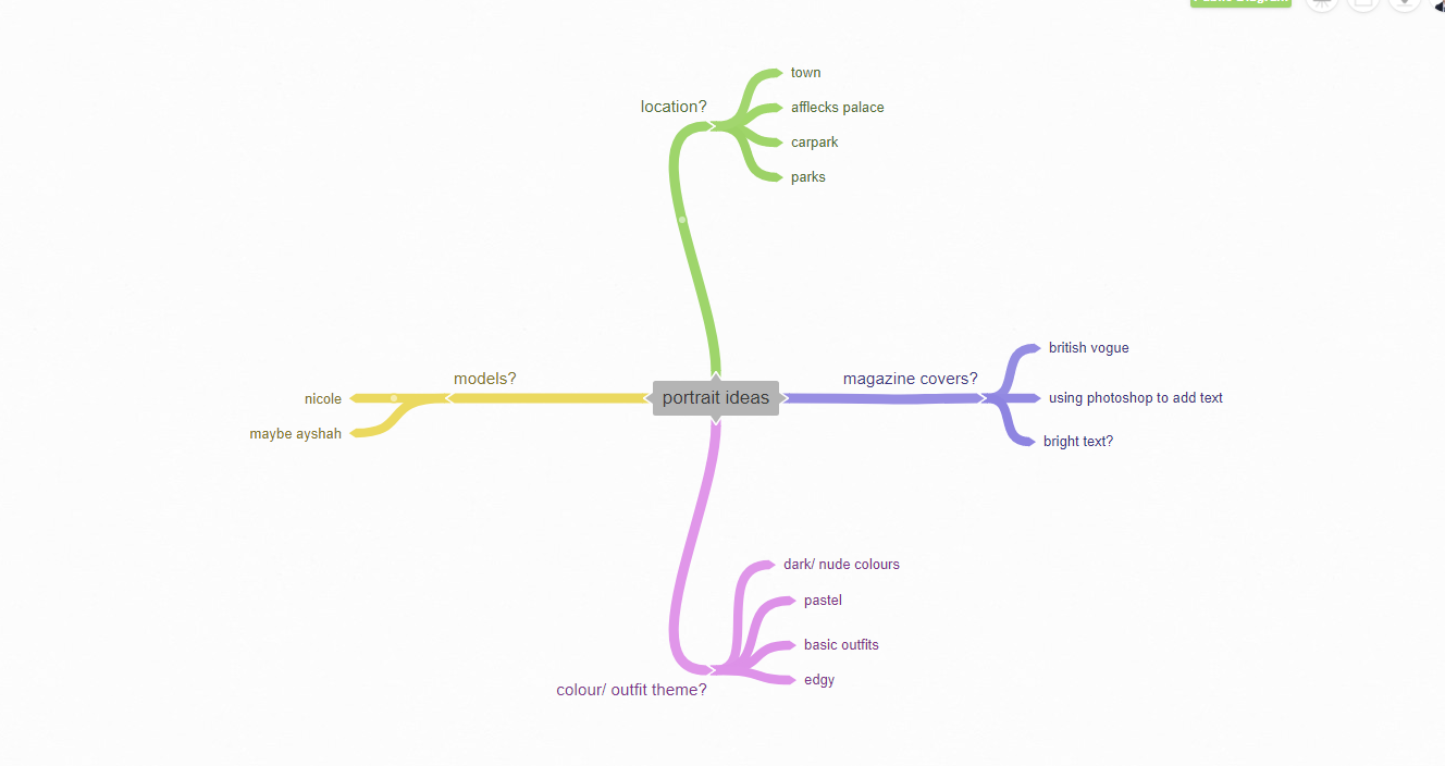
Mood board for portrait- Kia Hartelius


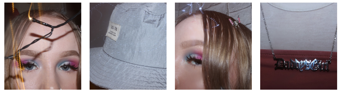
Planning my first shoot
My starting point is taking inspiration from a photographer called Kia Hartelius. Kia Hartelius is a fashion based photographer, she focuses on colourful, dark and light colours and how they contrast. However, her photos are quite simple with creates a nice touch to the photo. Kia Hartelius uses bright colours to contrast with warm colours for example on the first picture the model is wearing blue makeup and outfit which contrasts with her curly ginger hair. My theme is aesthetic clothing and accessories including bucket hats, butterfly clips, and clothing like an emo look and a more girly look, then I will start to look at bold colours. At first I was going to use pastel colours but I figured that idea didn't really match my mood boards. The colours I have now chosen are bright red, blue, and green. I will clothing throughout time through the pictures I take and the clothing that the model wears and how the photo is taken. My models are Ayshah Suleman, Nicole bowers and myself. The props I will need are- a wooden stool/chair, makeup, and a light which I can bring in myself. The equipment I will need is a camera, and a tripod. The location will be in school and the photos will be taken in front of paper backdrops. I will need to do most of my shoots independently meaning after school hours. I will take pictures of my models from different angles like the mood boards above and below. The camera settings I will use are white balance, ISO and a medium depth of field from aperture. I have also chosen these photos and this photographer because I like the bright colours contrasting with the lighter backgrounds.
First practice shoot


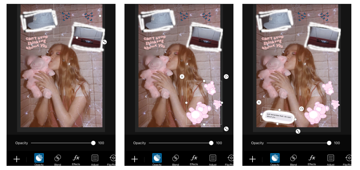
In these photos a different model was used as the original model was not free at the time. To take these photos I used a rainbow light, a tripod, orange paper, a reflector and a light. I don't really like these images because firstly the model is wearing a school uniform, and the yellow background
First real shoot, Ayshah
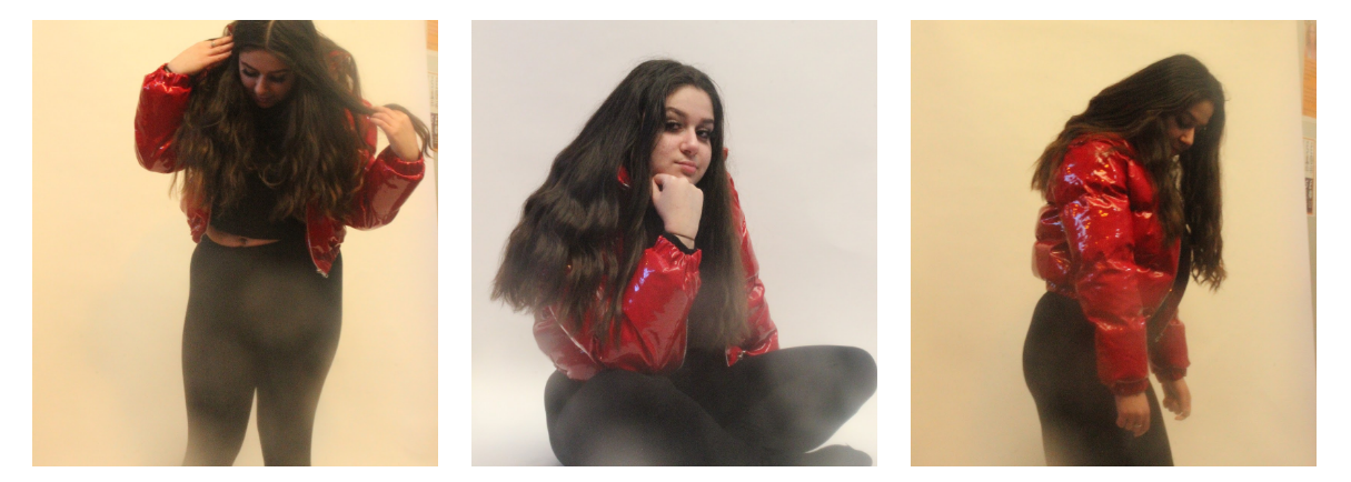
Best and worst

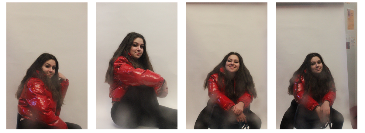
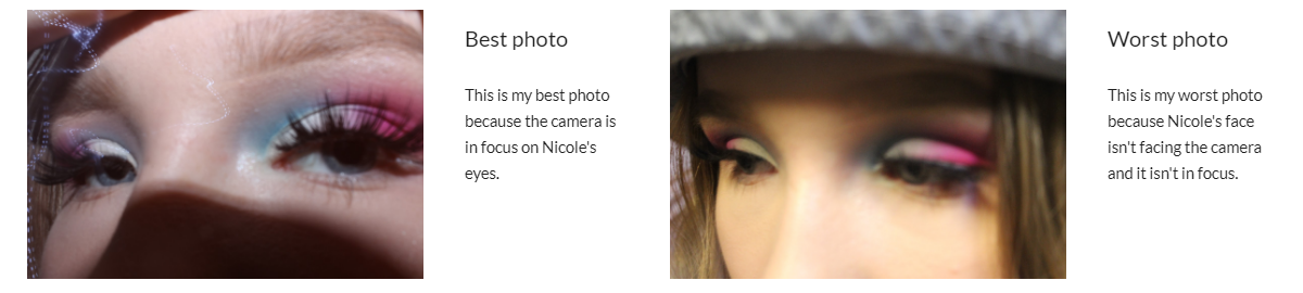
Second shoot, Nicole
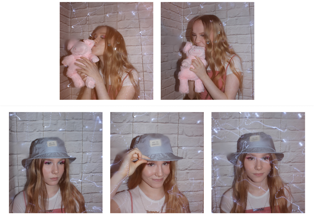
Best and worst
Starting image

Using photoshop app
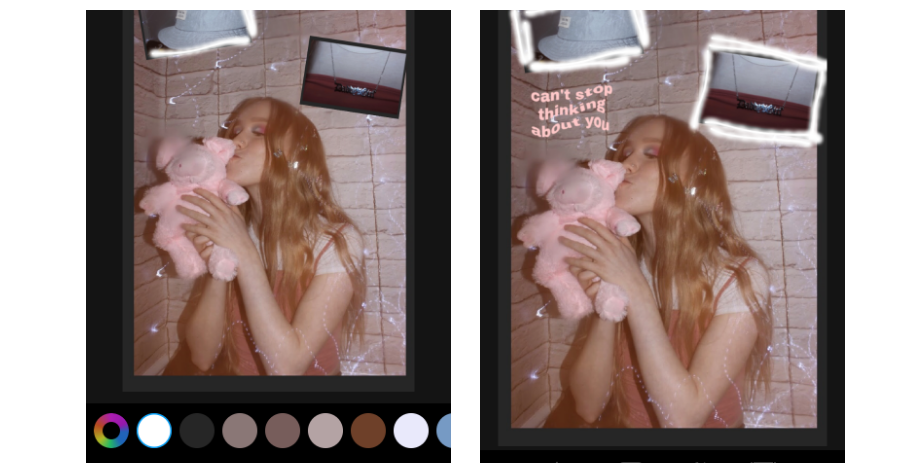
Final outcome

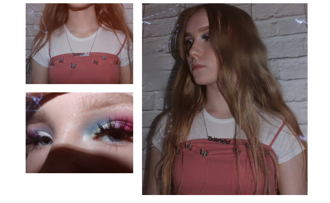
Shoot 3

Starting image

Photoshop
Final image

Evaluation
What was the project theme and what did you think of it?
The project theme was portrait and I enjoyed it because we learnt and used a range of different photo-shop techniques which were useful to get a much more professional and better outcome. In my project I focused on the theme of 'edgy' fashion because I liked the style of it and thought it would look cool as a vogue magazine or edited on an app.
What part of the project did you enjoy the most/found most interesting?
In the project, I found taking the photographs more interesting because a lot of my photos were taken outside of school so I found taking the photographs more fun than I would have done if I was in school. I also enjoyed taking the photographs more than the photo-shop because I got to be independent when taking them.
What new techniques have you experienced?
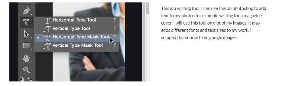
The new techniques I have experienced are adding 'VOGUE' text on my photographs to make them look cooler and more professional. I also used an app for some photo-shop/editing called 'PicsArt', on this I learnt how to drag smaller photos on to larger ones. I added filters onto my photographs to give them a bit more colour and to make them more styled by me.
What technique would you like to develop further?
The technique I would like to develop further is adding text to my photos because I like how the size of the text and the font can be changed to fit your personal idea on how you want your photograph to be presented. I would also like to further develop adding different shades of colour to my photographs because I think it would make the photo stand out so I could apply that to future work.
Which photographers did you research through this project?
Through this project I researched a photographer called Kia Hartelius. I researched this photographer because I wanted to take inspiration from her photos as she focuses on fashion in her photographs, and also I liked how she uses contrasting colours such as blue, orange and yellow in her photos and I thought that would be quite interesting to try out.
How have they influenced your photographs?
Kia Hartelius ' work has influenced my photographs because I took a photo-shoot inspired by her work- contrasting a bright red coat and a orange brick wall. Her work also influenced my photographs because the aesthetic that she uses in her photos inspired me to try it out and apply it to my own work.
What do you feel is the most successful part of your project and why?
In my opinion I think the most successful part of my project was the final prints because I got to see how my photographs developed through editing and photo-shop and then how they turned out afterwards. I also found that my website page for Portrait was very successful because the depth of the writing showed how I had a good understanding of my own research and where I am up to and my research supported that.
Did you encounter any problems in your project?
In my project the problems I encountered were the timing on when I could get my models to be in the photo-shoot, so my photo-shoot ended up being very last minute but I got all the work done so next time I will need to get everything sorted straight away. I also had a bit of trouble with how to edit/photo-shop my photographs but I ended up using an editing phone app by the name of 'PicsArt' which helped me a lot in my work.
How did you learn from them and how did they affect your final images?
By learning from them I tried over and over again to get a good and professional final product. They affected my final images massively because after trying over and over I developed the skill of how to photo-shop and this made my final images look better in order to get a higher grade on my overall project.
What would you do differently given the chance to complete the project again?
If I had a chance to complete the project again I would change the timing that I took the photographs in as I didn't give myself a lot of time so my final products could have been a bit more developed. I would also go back and add more developed final images to my work to get the extra marks and to make my work look neater and better.
The project theme was portrait and I enjoyed it because we learnt and used a range of different photo-shop techniques which were useful to get a much more professional and better outcome. In my project I focused on the theme of 'edgy' fashion because I liked the style of it and thought it would look cool as a vogue magazine or edited on an app.
What part of the project did you enjoy the most/found most interesting?
In the project, I found taking the photographs more interesting because a lot of my photos were taken outside of school so I found taking the photographs more fun than I would have done if I was in school. I also enjoyed taking the photographs more than the photo-shop because I got to be independent when taking them.
What new techniques have you experienced?
The new techniques I have experienced are adding 'VOGUE' text on my photographs to make them look cooler and more professional. I also used an app for some photo-shop/editing called 'PicsArt', on this I learnt how to drag smaller photos on to larger ones. I added filters onto my photographs to give them a bit more colour and to make them more styled by me.
What technique would you like to develop further?
The technique I would like to develop further is adding text to my photos because I like how the size of the text and the font can be changed to fit your personal idea on how you want your photograph to be presented. I would also like to further develop adding different shades of colour to my photographs because I think it would make the photo stand out so I could apply that to future work.
Which photographers did you research through this project?
Through this project I researched a photographer called Kia Hartelius. I researched this photographer because I wanted to take inspiration from her photos as she focuses on fashion in her photographs, and also I liked how she uses contrasting colours such as blue, orange and yellow in her photos and I thought that would be quite interesting to try out.
How have they influenced your photographs?
Kia Hartelius ' work has influenced my photographs because I took a photo-shoot inspired by her work- contrasting a bright red coat and a orange brick wall. Her work also influenced my photographs because the aesthetic that she uses in her photos inspired me to try it out and apply it to my own work.
What do you feel is the most successful part of your project and why?
In my opinion I think the most successful part of my project was the final prints because I got to see how my photographs developed through editing and photo-shop and then how they turned out afterwards. I also found that my website page for Portrait was very successful because the depth of the writing showed how I had a good understanding of my own research and where I am up to and my research supported that.
Did you encounter any problems in your project?
In my project the problems I encountered were the timing on when I could get my models to be in the photo-shoot, so my photo-shoot ended up being very last minute but I got all the work done so next time I will need to get everything sorted straight away. I also had a bit of trouble with how to edit/photo-shop my photographs but I ended up using an editing phone app by the name of 'PicsArt' which helped me a lot in my work.
How did you learn from them and how did they affect your final images?
By learning from them I tried over and over again to get a good and professional final product. They affected my final images massively because after trying over and over I developed the skill of how to photo-shop and this made my final images look better in order to get a higher grade on my overall project.
What would you do differently given the chance to complete the project again?
If I had a chance to complete the project again I would change the timing that I took the photographs in as I didn't give myself a lot of time so my final products could have been a bit more developed. I would also go back and add more developed final images to my work to get the extra marks and to make my work look neater and better.
