"𝒜𝓇𝓉 𝒸𝒶𝓅𝓉𝓊𝓇𝑒𝒹 𝒾𝓃 𝒶 𝓅𝒾𝒸𝓉𝓊𝓇𝑒" - 𝑀𝓎𝓈𝑒𝓁𝒻
Statement of intent:
What is your chosen theme?
My chosen theme for my GCSE main project is going to be focused around ‘Texture’. I am going to be looking at different types of texture such as: urban, natural and different objects such as jewelry and makeup. I like the idea of using different textures that I can compare and contrast and I hope will give me some interesting outcomes
What research do you intend to carry out based on this theme?
In order to produce a successful, creative and individual final main project, I need to start by doing some in-depth research around my chosen theme. I am going to do this by- going onto the internet and researching some famous photographs that are based around the theme of texture and I intend to research at least 3 famous photographers.
I will also look into magazines, books and videos on youtube to extend my research that I hope will inspire my final outcomes. To express my ideas I will create a mood board and a mindmap so that I can place all of my ideas into one area and see which ideas I like the most. I already have a pinterest account so I am going to use the pinterest app on my phone to help me with ideas on my project. I hope to explore lots of different options so that I build up an intricate understanding of my chosen theme. I also need to have a wide range of research using a variety of different media to insure that my project is well informed and well in-depth.
What photoshoots do you intend to complete during this project to help explore the chosen topic?
I intend to capture a vast amount of photoshoots to explore my chosen theme. I will involve myself in a number of photo-shoots both inside and outside of the school environment to progress my ideas capturing specific photoshoots influenced by my chosen artists from my research but I also wish to take broader photoshoots to indulge in the creativity.
What techniques with the camera, darkroom and Photoshop would you like to use to develop the theme?
Throughout this project I will use a variety of techniques within the camera such as: shutter speed, iso, white balance, rule of thirds, composition and exposure triangle. When I am using photoshop I hope to use: layers, opacity, brush tools, dodge and burn, saturation, sharpener, blur tool and spot healing tool. I could also use my mobile phone to use apps like Snapseed and Lens Flare.
What do I hope to learn more about in doing this project?
By doing this project, I hope to learn more about the theme of Texture but also how to take my work on a journey to success and create a very meaningful and personal project. I hope to finalise the skills I have learnt throughout my year 10 and 11 photography course and successfully implement them into my final piece.
What do you see your final format as being?
For my final format I am going to have 10 final images for my gallery. I am also going to print out my final gallery and laminate them and hang them from a wall of ceiling. I want to do this for my final format because nobody else in the class has thought of this idea so it'd be very unique and personal to me.
Daniel Coyle : Mock Exam

Context
The photographer of the Lone Tree, Buttermere is Daniel Coyle and he is from St. Louis, Missouri, United states. His photograph was taken in Buttermere, Cockermouth.
Composition
In the image there is a foreground, middle and a distance. The foreground is in the grass area. This makes me presume that the photographer took the picture standing in the grass. The middle is the water. This makes us feels like we are not only in the picture but we are in a calm and soothing environment. In the distance we can see the sunset and some mountains. The sunset is very pleasing to the human eye. There are strong leading lines and they impact the image because the mountains and the skies contrast. Coyle has used the 'sweet spot' in the rule of thirds. He has used a sweet spot to direct us to look at a certain place in the picture which is the water and how the sky reflects off of it. The view point is at eye level. The impact of this is so when people look at the photograph they look at all the different areas of the image. In my opinion he has used colour photoshop on the clouds so they look nicer and appear prettier as they are pink, purple and an orangey-gold colour. I think Coyle used photoshop so it is more appealing to the eye and overall just so it has a nicer affect. In my opinion, I can tell that the photographer has used white balance because the photograph is a bit brighter in some areas. I think the image is not too over-exposed, it is just right. I don't think the photographer has used a tripod because we can still see the grass in the image but I think if a tripod was to be used we would be able to see the grass. The main colours in the photograph are pink, purple, orangey-gold and a brownish black colour. The choice of colours creates a very beautiful impact because the image looks more detailed. There are no patterns in the image. I don't think the image has been cropped, as it doesn't look like it has. In the photograph there is a Lone Tree. This fits in really well with the photo because it add some more darkness to the picture and it looks more appealing.
Connections
I like this photograph because I think that it can be very appealing and also the colours and the objects fit in really well with the theme. This photograph has a vast amount of detail and it is a very beautiful image. Their work links to mine because I have done some photography on trees and so has he. The strengths of this image are that there are a lot of calming and they have used a sweet spot. What the photographer could do better was add some more branches or maybe photoshop some birds.
Inspiration
I want to achieve an image similar to to this with some of the same pastel colours because they are really nice. I can use this photograph for inspiration in my own photography because it uses a lot of different photo-shop techniques that I could portray in my own work.
2nd photography research, Ansel Adams

Context
For my second artist research I am going to be focusing on Ansel Adams. Ansel Adams was an American photographer born on the 20th February 1902 in Western addition, San Francisco, California, United States and he died on the 22nd of April 1984 in Bariatric Surgery Centre at Community Hospital of the Monterey Peninsula, Monterey, California, United States. Adams took his images at Yosemite Valley in Central California. He learned darkroom techniques and read photography magazines, attended camera club meetings, and went to photography and art exhibits. Ansel Adams was an American landscape photographer and environmentalist known for his black-and-white images of the American West. He preferred taking his photographs in black and white because he felt color could be distracting, and could therefore divert an artist's attention from the achievement of his full potential when taking a photograph. Adams faced challenges such as he was injured in the San Francisco earthquake of 1906, when an aftershock threw him into a garden wall. His broken nose was never properly set, remaining crooked for the rest of his life.
- all research from 'context' has been sourced from google.
Composition
The rule of thirds has not been used in this image however there are strong leading lines. Ansel Adams has also used a deep depth of field on the mountains but has not used a shallow depth of field. In this image there is a foreground, middle ground and distance. This photograph was shot in front of a big mountain in Yosemite Valley. I think yes this artist has used a tripod because the whole image is shown and it is very straight and it’s not zoomed in. I don’t think white balance or iso has been used in this image because there aren’t any particular light spots in the image.
Connections
I like Ansel’s work because the black and white in his work makes it easier for us to see the different textures even on his landscape based photographs. Ansel’s work consists of black and white over his images and his most famous photograph ‘half dome’ has a black shadow over it which looks really cool and pretty. I also really like how the moon is in the corner of the picture because it just gives it a nice touch. I can link Ansel’s work to mine because I want to look into using black and white filters in my own photography and when using photoshop because it makes the textures stand out more. Ansel Adams has a few strengths including; the way he has added shadows into his work gives it a cool, modern effect. Another strength is I really like the way the moon looks in the corner of some of his work- it looks very pretty. One weakness I could give to Ansel Adams would be to not make the side mountains black because then we can’t see them.
Inspiration
I would like to achieve similar images to Ansel’s. In my own photography I would like to focus on adding black and white to my photographs when using photoshop/photopea. I want my final outcomes to have black and white because then the texture of my images will be more noticable and easier to see which is what I want.
3rd photography research, Aaron Siskind

Context
My artist research photographer is Aaron Siskind. Aaron Siskind was an American photographer born on the 4th September 1903 in New York and died on the 8th February 1991 in Rhode Island. Siskind attended DeWitt Clinton High School as a boy and later on went onto the city college of New York, 1926. He is known for texture photography and alot of his work is based on brick walls, nature, seaweed, ropes and footprints in the sand. The photographers pictures were taken in Martha’s Vineyard. He started taking his photos in 1932- during the great depression.
Composition
In this image, the photographer has not used the rule of thirds, but instead I have used central photography- this draws our eyes to the middle of the picture. There are not any strong leading lines as the picture is very self centered. Siskind uses a deep depth of field- this makes the image very sharp and clear. I think he used this to show the sharpness of the image. The picture looks like it was shot on a tree where the bark is peeling. This gives it a more textured look. I think the photographer could have used a tripod as it is very centered. The photographer has definitely used white balance and iso to lighten the image as some parts of the pictures larger areas are lighter.
Connections
I really like the aesthetic of Aaron Siskind’s work because firstly, the amount of texture in his images are amazing. He also focuses on black and white filters in his photography and I really like the way the two themes contrast as it is very pretty and appealing. Siskind’s work links to mine because I am looking at developing my work further when I reach nearer to the end of my course to do black and white and texture. This photographer has many strengths including the little details of black and white and the way it sits with the texture. Another strength is the way the texture is captured in his images- I really like how some areas of the texture is lighter in some places and darker in others.It looks really cool. The photographer has some weaknesses including: some places in the image are very dark and the texture of the picture is very hard to pick up on.
Inspiration
I would like to achieve some outcomes similar to Siskind’s because I think it would really give my work a boost into a higher level. To achieve images like these, I am going to focus on black and white and patterns in my photography shoots and when using photopea. Another thing I am going to do to achieve this is look into other photographers so I can piece together all of my work when it comes to doing final outcomes.
Mind-map of texture ideas

Mood board of ideas for texture

Shoot 1
Shells/leaves


Best |
Worst |
|
This is my best photo from the first gallery because it is very clear and you can see all the leaves' texture well.
|
This is my worst photo because it is very blurry and you can't really see the image as clear as the first one.
|
Wood


Best |
Worst |

|
This is my best photo because the objects are well spread out.
|
This is my worst photo because some body's hand got in the background of the picture and it also just has random objects in it.
|
Shells


Best |
Worst |
|
This is my best photo because you can really see all the different textures on the shells.
|
This is my worst photo because the camera quality is very blurry.
|
Shells and feathers


Best |
Worst |
|
This is my best photograph because all of the shell and feathers are grouped together well.
|
This is my worst photograph because the white balance isn't focused on the objects.
|
Pinecones


Best |
Worst |

|
This is my best image because the camera was put close up to the pinecones so the texture is clearer.
|
This is my worst image because you can only see one of the pinecones as the rest are blurry.
|
Shoot 2
Leaves


Best |
Worst |
|
This is my best image because the texture of the leaves is more defined.
|
This is my worst image because you can see the school gate's in the background of the picture.
|
Rusted paint with leaves


Best |
Worst |
|
This is my best image because you can see a lot of the rusted paint and the leaves.
|
This is my worst image because the gate is in the way of the photograph.
|
Ivy


Best |
Worst |
|
This is my best image because I have used a shallow depth of field to make the background blurry and to make it look it in focus.
|
This is my worst image because the composition is not in focus.
|
Berry bushes


Best |
Worst |
|
This is my best photograph because the shutter speed is in focus in on the berries.
|
This is my worst photograph mainly because the berries aren't really in focus with the camera.
|
Grass with leaves


Best |
Worst |
|
This is my best image because the leaves are all huddled closely together and we can really acknowledge the texture of the leaves,.
|
This is my worst image because the leaves aren't near each-other at all and are very far apart and there are twigs mixed in with the grass which ruins the colour scheme.
|
Shoot 3
Leaves


Best |
Worst |

|
This is my best image because the white balance is right and there is just enough light reflecting on the leaves.
|
This is my worst image because the lighting is in the wrong corner of the picture and the rest or the image is dark.
|
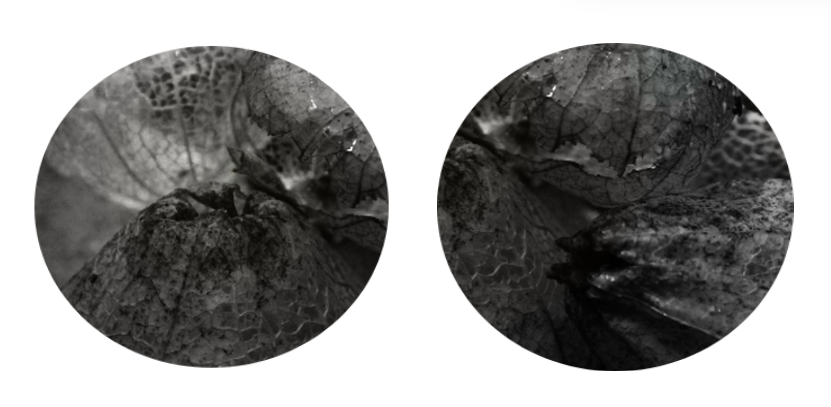
Tomatillo's


Best |
Worst |
|
This is my best image because the light is hitting the tomatillo's perfectly as there is not too much but not too little either.
|
This is my worst image because there is not enough light hitting the tomatillo's and the ones that are stood up at the front of the image are very blurry and you can't really see the texture.
|
Man-made texture


Best |
Worst |
|
This is my best image because I can clearly see the texture in the picture and there is no objects in the background.
|
This is my worst image because it is a bit blurry and the texture isn't very visible. This is also my worst image because there is some objects in the background.
|
Screws


Best |
Worst |
|
This is my best image because I can clearly see the texture of the screws and it is very close up. I also really like that the screws in the background are blurry so the other one is really clear and noticeable.
|
This is my worst image because the texture of the screws is not very noticeable and all of the screws are very blurry.
|
Working with a professional photographer
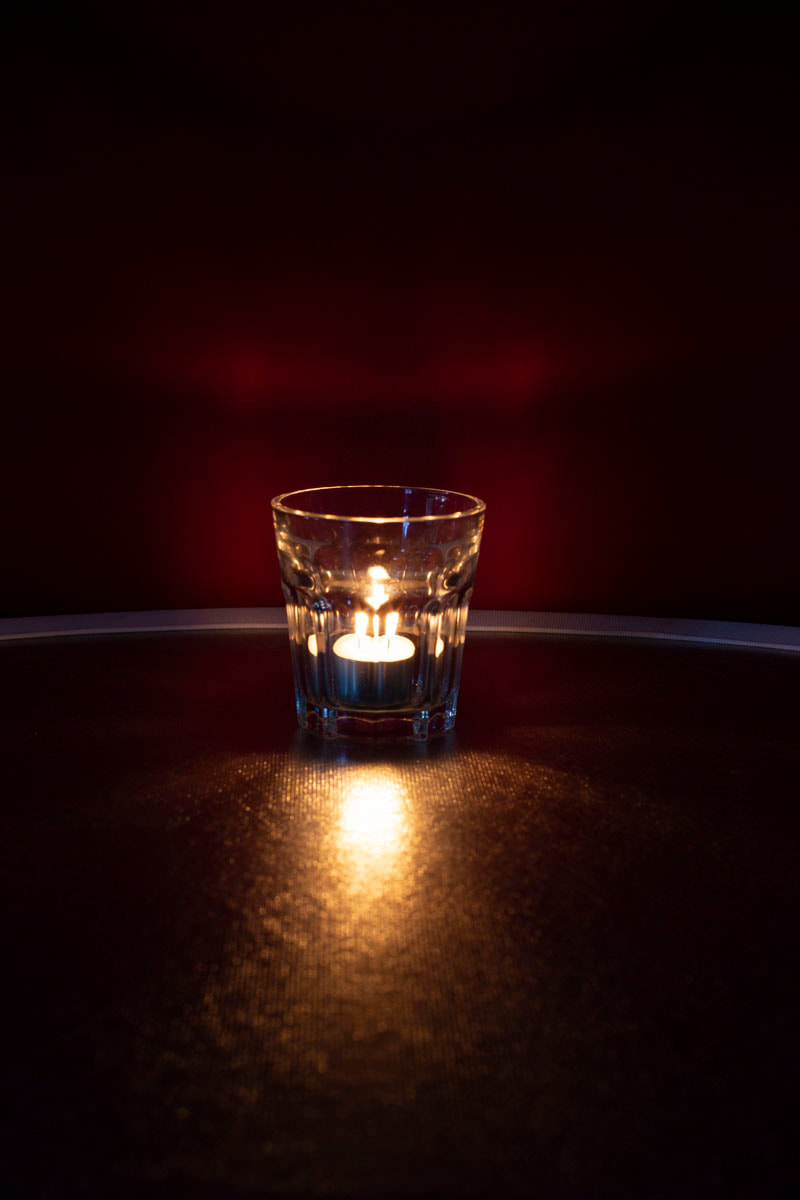
I worked with a professional photographer and I used a red backdrop, a canon camera on a tripod, a glass cup and some tealights. I took over 100 photographs using light in texture and I took some pictures up close to see what the light looked like inside of the glass cup.


Light texture


Best |
Worst |
|
This is my best image because I love the way the light from the candle is reflecting off the table and how the light reflects off the brim of the glass to make what looks like a theatre curtain.
|
This is my worst image because the exposure on the camera was set to high so it made my photo appear darker.
|
More tealights in glasses


Best |
Worst |

|
This is my best image because the glass is really close up and it looks really pretty. I also like this image because there is no blurriness in the image and the way the camera has captured the candle light looks really cool.
|
This is my worst image because there is no objects in the picture and it is very blurry.
|
Close up tea light


Best |
Worst |
|
This is my best image because the candle light has really been captured in the picture.
|
This is my worst picture because there is too much light in the picture and the white balance is too high.
|
Close tea lights


Best |
Worst |
|
This is my best/favourite image because even though it is very dark in the background I really like how the camera has picked up the actual light in the tealight because it looks very nice.
|
This is my worst image because I don't like how bright the image is/ the white balance is too high.
|
Wine glasses close up


Best |
Worst |

|
This is my best image because the wine glass is placed right in the middle of the image and the lighting looks really nice hitting the side of the glass and I like how the background of the photograph looks very simple.
|
This is my worst image because there isn't much lighting in the image and the hand reflecting in the glass kind of ruined it.
|
My photography journey
Photographs I have already taken
In the half term holidays of September I had to come into school for an hour to work with a professional photographer (as I didn’t go on the trip to the Lake District) called Justin. Whilst working on texture instead of Landscape I focused on light in texture. I also took a variety of photos of tealights in a glass and how the flame reflected in a dark light and many others. Taking these helped me to build up my website because I had a range of images to put onto my website from all different areas of light in texture.
Next steps
I am going to look into doing some research on Martin Lawrence as he did some similar photography in terms of texture and I am going to research 2 more photographers so I have at least 3 to research and write about. To make my images similar to Martin Lawrence I am going to watch some you-tube tutorials on photoshop and try to use some of the same colours and he has used and to develop my work further. Also I am going to use the app ‘Pinterest’ on my phone to look at different aesthetics texture wise to inspire my outcomes. On photo-shop I am going to start by using small simple filters and then complicated tools to develop the images further as they will be more advanced and meaningful to me.
Development
To develop my work I am going to do another shoot of light in texture. Then I am going to photo-shop some of the light texture photos that I took with Justin and I am going to add more colour to them to give me a better outcome. To do my next photoshoot I will need to borrow a camera and I am going to take pictures at night time to give the full effect of the light. I am going to take pictures of lit candles and also tea lights inside of glasses.
Mock exam
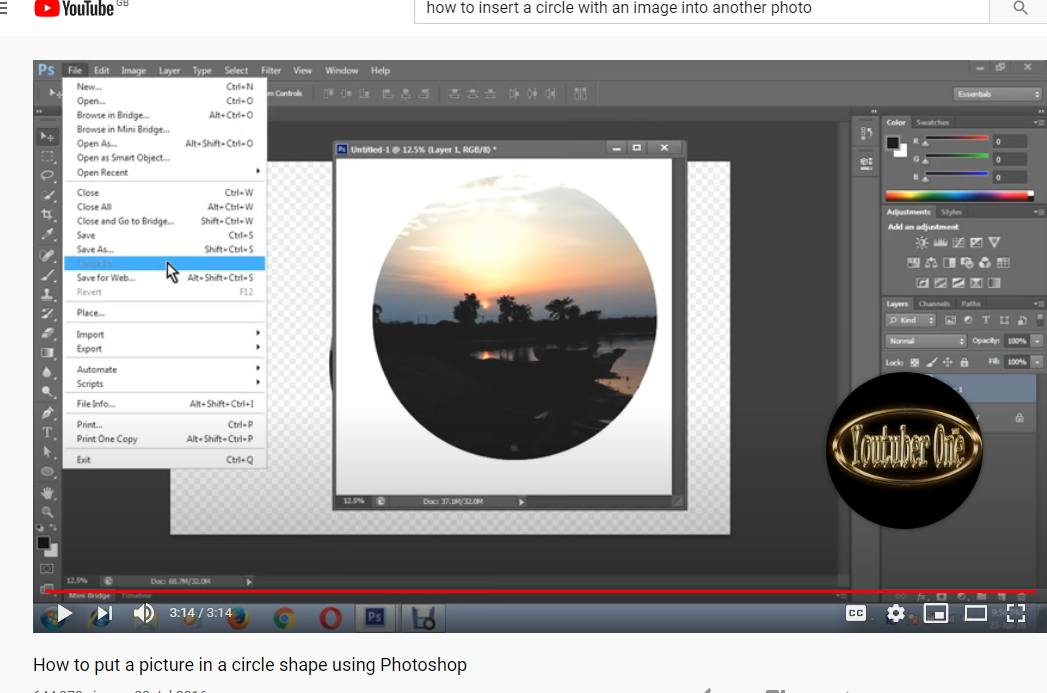
I watched this you-tube tutorial because I wanted to insert a photo into a circle and then add place it in a different background.
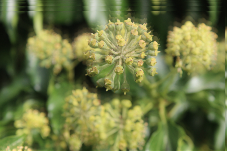
Starting outcomes
Working through photoshop


Final Outcome
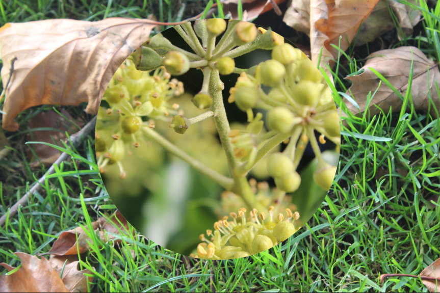
Developing my ideas using patterns
Starting images

Tutorial link:
https://www.loom.com/share/0e49f3add73746d480efc5ab9df0b093
Using photopea


To develop my photography I brought the image into Photopea and then used the adjustment layer on the image tab. I chose to use layers because I've never tried then before and it looks good. I really like this because in my opinion it gives the picture a cooler effect and it isn't boring. To get the final result that I did I used magic cut and duplicate layers to make an interesting 4 layer pattern.
To develop my photograph I added the 4 glass layers into a pattern and put then on top of a brick wall because I thought it would change the vibe a bit because the glass cups look different on the brick wall so it creates a contrast between the two textures- (brick texture and light in texture). In my opinion I really love the glass against the brick because it the two completely different textures look dashing.
To develop my photograph I added the 4 glass layers into a pattern and put then on top of a brick wall because I thought it would change the vibe a bit because the glass cups look different on the brick wall so it creates a contrast between the two textures- (brick texture and light in texture). In my opinion I really love the glass against the brick because it the two completely different textures look dashing.
Developing my ideas using black and white filter
Starting image

Tutorial link:
Using photopea


Final image

To develop my photography I brought the image into Photopea and then I used a crystalizer but I didn't like the affect it had on my picture so took it off. Instead I used the black and white filter and changed the colour tones down. I toned down the blue, red and green but hightened the yellow because it looked cool. After that I used the 'curves' tool to curve my image a bit. Finally, I used Lens Flare to add a white shadow to the corner of my image. I really like this because firstly I have never used these techniques before and also, it upgrades my photograph and adds a cooler effect.
Developing my idea's using adjustments to enhance colours
Starting image

Tutorial link:
Using photopea


Final image

To develop my photography, I decided to try out 'colour enhancing'. I reaaly liked how I enhanced the colours on this because the red looks very bright and cool. I think I would like to use the 'enhancing colours' in my final galleries because I really like the look of it and it could make a really pretty contrast side to side next to black and white.
Developing my ideas using layers
Starting image

Tutorial link:
https://www.loom.com/share/ae221a10a3c8473d930d13587011c4db
Using photopea


Final outcome
Here to develop my photography I wanted to try out 'layers'. I didn't prefferably like using this method because the picture looks almost the same that it did before I added any photoshop/layers so it's not my favourite photoshop took to use.
Starting image

Tutorial link:
https://www.youtube.com/watch?v=syZ9xcw-fKk
Using photopea


Final outcome

Developing my ideas further and refining my outcomes for a final gallery
So far in my project I have been using 2 different pieces of software, Photoshop and Photopea. I have been experimenting/developing/refining my own photographs so that I enhance/ appeal the final outcomes. The tools I have been using are Lensflare, magic cut, selection tool, layers, image/adjustments and the black and white filter. This has helped me to develop my techniques/skills/knowledge. The more I have practiced and watched the tutorials provided, the better my outcomes have become. The techniques/tools that I have found very effective were the magic cut and the adjustments tools which helped me a lot to make my black and white final outcome. I also tried using the adjustments to enhance colours but I did not like the outcome so much, however it did help to develop my knowledge of the software. To develop my final images I need to take more pictures so I can have mire images to photoshop and it would help my grade if I had more pictures because I would have more evidence. For my final outcomes I hope/think/plan/determined to refine my final images around the theme around black and white, colour and patterns. I want to add black and white and colour to my images and contrast them side to side to show a difference. I mainly want to take pictures of nature so I can contrast the way we see the world both in colour and black and white I am going to use a range of tutorials to develop my outcomes in my new theme 'contrasts'.
Tutorials I am going to use:
Making colours pop in photoshop: https://www.youtube.com/watch?v=163KclzPM98
Trapping a colour in a black and white image: https://www.youtube.com/watch?v=UEkZ28YkH9Y
Adding black and white to an image: https://www.youtube.com/watch?v=Vn_pB2wJNoc
My final gallery


Instillation Gallery


Evaluation
My theme was black and white and colour in texture. I was very enthusiastic and excited to start this project because it meant that I could capture the beauty of nature and change the photographs around on photopea to suit my theme. I also really liked this project because I was able to develop my photographic technique.
In my opinion, the best part of my project was working with a professional photographer. Although I was unable to go to the lake district I was able to come into school and work with a photographer. I enjoyed this because I was able to work in a professional setup and I got to experiment with all different equiptment and take observational pictures. When I worked with Justin I focused all my attention on light in texture. To do this I experimented with tea lights and glass cups/jars to capture the light reflecting off the texture of the glass. This was very appealing.
I have experienced a lot of new techniques that I would have not ever tried before. A few of these include: watching tutorials on how to drag part of an image onto another image. I also learnt how to create patterns on my pictures. I especially liked adding patterns to my pictures because it was really cool to see different ways in which I could upgrade my pictures.
A technique I would like to develop further is the contrasts between light and dark in texture. I like this because taking pictures with the professional photographer made me able to collect a whole new range of skills and it will help me to add something new to my page that someone else may have not tried in the past.
One of the few photographers I had researched was Daniel Coyle. I really liked his work as his photographs were very in depth and they are very professional. This photographers work impacted my own because I was able to use to use some of the same colours and photoshop techniques in my own work, however, it was not as useful as it could have been as my theme was based on texture instead of landscape.
Over the course of my journey, I have mainly enjoyed working with a professional photographer. i was able to work in a professional setup with high quality equiptment. i enjoyed this part of my photography journey with texture the most because i was able to discover new techniques that I hadn't ever tried/used before. I also enjoyed this because I learnt how to take my pictures from different angles.
The most successful part of my photographic journey will be finishing my current theme: texture. To end this project I would like to make a sketch book/ mood board with a collage of all of my final mages in one place. I would really like this because it would be something that I haven't ever tried before and it would be interesting to try out.
During this project, I encountered a lot of problems- mainly due to the coronavirus. Due to this I was unable to complete all of my course work (as I wasn't able to access photoshop or any of my pictures) and sometimes I would fall behind on lessons and work. This was quite hard fo me to deal with as I had fallen behind on quite a bit of work over the course of the lockdown.
Learning from this, when I returned to school I made sure to catch up on all work. This would help me to develop a higher grade at the end of my year 11 journey. I have currently been developing my weebly website in every possible way that I can in lessons and due to lockdown as we were unable to access photoshop we used photopea instead- (an online editing website) and i have continued to use this in school. This is better for me because it is more accessable both at school and home- if we were to go back into another lockdown.
Given the chance to re do and complete this project again, I would have made sure to be more focused on my work during the lockdown. This would have meant that I could have developed my photographic skills both at home and school.
